DataViz
Government Debt Visualization
This shows different visualization from data gotten from General Government Debt.
Original Chart on Website
Modified Chart on Tableau
Custom Chart
Comparisons among the Charts
The first method is a great way of visualizing the % GDP for each country for a single year. From the bar chart, one can quickly determine which countries have the highest debt (as it relates to their GDPs) and which countries have the least. Because the chart was also sorted, it was easy to tease out the information. I also like that the chart had the average as a baseline (in black) to ground the number on the chart to determine what was above average and below.
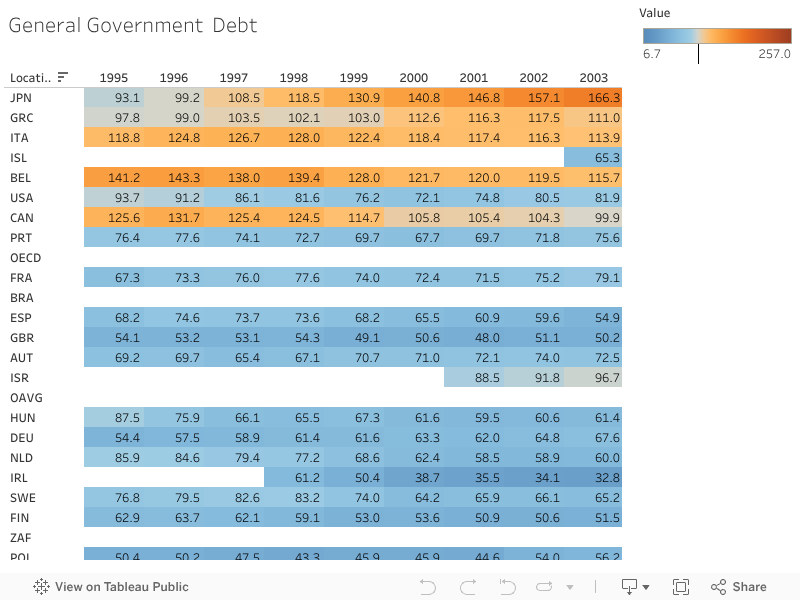
The second chart is better for depicting the timeline of how countries dept increased or decreased. Because of the choice of color at first glance, it is easy to see which countries are decreasing and increasing their debt and the choice of the two contrasting colors makes it easier to approximate when a country has drastically increased or decreased.
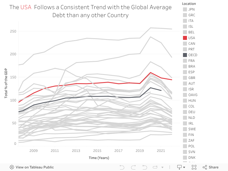
The third chart does a good job of showing trends without the specificity of the values of %GDP. The chart focuses on the USA and the trend since 2008 (when the average started being collected to compare one to one. The colors used in the chart allow users to easily follow the trend of the US and the average trend while also comparing the trend to the others in gray. This allows the reader to get a general sense of the direction the US debt is going.
In summary, the first chart is ideal for comparing the individual years for the countries’ total % of GDP, the second chart is ideal for quickly determining the trend over the years of the countries’ GDP with the specific values while the third chart also shows a trend but eliminates the specific number associated with each year and focuses on a particular country.